If you're creating an "admin" style Angular app, chances are pretty good you'll want a responsive sidebar menu. Fortunately, you can easily add one with the aid of the Angular Material and Flex-Layout projects.
In fact, you can have a great-looking sidebar up and at 'em in just a few minutes!
Follow this guide and I'll show you how.
If you'd prefer to go straight to the code, you can do so by just grabbing the branch on GitHub.
Remember, though: if you're having problems running the Angular app locally, be sure to check the README.
Please note: this guide is a part of an ongoing series of tutorials on how to create a customer relationship management (CRM) application from scratch. The GitHub code for each guide belongs to a specific branch. The master branch holds the entire application up to the current date. If you want to follow the whole series, just view the careydevelopmentcrm tag. Note that the website displays the guides in reverse chronological order so if you want to start from the beginning, go to the last page.
The Business Requirements
Your boss Smithers walks into your office and tells you it's time to beef up the user interface on that CRM application you've been working on.
Specifically, he wants a sidebar menu.
"Because a sidebar menu works best for this kind of app," he says.
Grabbing the Dependencies
First up, make sure you have both Angular Material and Flex-Layout installed. I explained how to do that in the previous guide.
(It ain't hard, though.)
Once you have those installed, it's time to get busy building the sidebar menu bit by bit.
The Menu Item Component
The first bit you need to create is a menu item component. It represents one clickable word in the sidebar menu that takes users to a new location.
So go to a command prompt and navigate to the root directory of where your Angular source is located. Then, enter the following command:
ng g c features/ui/menu-list-item
That's going to create a menu item component.
Why is it under features/ui? Because the UI you're working on here is specific to your app's features, such as creating a new contact, editing a contact, and modifying user info.
Remember, the login module uses a separate UI. That's because you don't want to show the sidebar when people login. Again, feel free to take a look at the previous guide for more info on that.
Also, it looks like I got too agressive with creating a features module in the last guide. You don't need a features module, just a features component. You'll see why in a moment.
Feel free to delete features.module.ts if it's in your source tree. You'll also need to eliminate any references to it in app.module.ts.
Also, if you haven't already done so, create the user module and dashboard module with associated components:
ng g m features/user
ng g c features/user
ng g m features/dashboard
ng g c features/dashboard
Modifying AppModule
Go ahead and edit app.module.ts to look like this:
import { BrowserModule } from '@angular/platform-browser';
import { FlexLayoutModule } from '@angular/flex-layout';
import { MatToolbarModule } from '@angular/material/toolbar';
import { MatSidenavModule } from '@angular/material/sidenav';
import { MatListModule } from '@angular/material/list';
import { MatIconModule } from '@angular/material/icon';
import { MenuListItemComponent } from './features/ui/menu-list-item/menu-list-item.component';
import { NgModule } from '@angular/core';
import { AppComponent } from './app.component';
import { AppRoutingModule } from './app-routing.module';
import { HttpClientModule, HTTP_INTERCEPTORS } from '@angular/common/http';
import { BrowserAnimationsModule } from '@angular/platform-browser/animations';
import { FeaturesComponent } from './features/features.component';

@NgModule({
  declarations: [
        AppComponent,
        MenuListItemComponent,
        FeaturesComponent
  ],
  imports: [
      BrowserModule,
      FlexLayoutModule,
      HttpClientModule,
      AppRoutingModule,
      BrowserAnimationsModule,
      MatToolbarModule,
      MatSidenavModule,
      MatListModule,
      MatIconModule
  ],
  providers: [],
  bootstrap: [AppComponent]
})
export class AppModule { }
That will give you the modules and components you need to take care of business in this guide.
Adding the Models
Now, within your Microsoft Visual Studio IDE, you should see a ui folder under src/app/features. Right-click on that subdirectory and select Add and New Folder from the context menu that appears.
Name that new folder model.
Now, right-click on the model folder and select Add and New File from the context menu that appears. Name the new file nav-item.ts.
That's going to be the model that represents a menu item on the sidebar. Add this code:
export interface NavItem {
  displayName: string;
  disabled?: boolean;
  iconName: string;
  route?: string;
  children?: NavItem[];
}
Most of the properties are fairly intuitive. I'll just explain a few of them here.
The displayName property is the menu item word or words that the user will see.
The iconName property is the name of the Material Design icon that will appear next to the text on the menu item.
The route property tells the app where to send users who click on that menu item.
And, finally, children identifies menu items that fall under this parent menu item.
Keep in mind, though: not all menu items have children.
Making the Menu
While you're still in that model folder, go ahead and create a new file called menu.ts. It will represent the entire sidebar menu.
Here's the code:
import { NavItem } from './nav-item';

export let menu: NavItem[] = [
  {
    displayName: 'Dashboard',
    iconName: 'dashboard',
    route: 'dashboard'
  },
  {
    displayName: 'User',
    iconName: 'face',
    route: 'user',
    children: [
      {
        displayName: 'Account Info',
        iconName: 'account_box',
        route: 'user/account-info'
      }
    ]
  }
];
The first thing the code does is import the NavItem type for use here. That's the interface you just created above.
Next, it creates an array of NavItem types. Or, more specifically, it creates a tree.
That export let bit towards the top might seem a bit awkward. That's how you tell TypeScript to create an array and export it at the same time.
As you can see from looking at the array, the code creates two top-level menu items: one for the dashboard and one for user-related activities (like editing the user profile, adding a profile pic, etc.).
The user-related menu item has a single child item that takes users to the Account Info part of the app.
Save this file. You'll need it later.
In Need of Service
Next, create another folder under ui. Call it service.
Within the service folder, create a new file called nav.service.ts.
Populate that file with this code:
import { Injectable } from '@angular/core';
import { Event, NavigationEnd, Router } from '@angular/router';
import { BehaviorSubject } from 'rxjs';

@Injectable({ providedIn: 'root' })
export class NavService {
    public currentUrl = new BehaviorSubject<string>(undefined);

    constructor(private router: Router) {
        this.router.events.subscribe((event: Event) => {
            if (event instanceof NavigationEnd) {
                this.currentUrl.next(event.urlAfterRedirects);
            }
        });
    }
}
TL;DR that gives out the current URL that the user is looking at.
Why do you need that info for a sidebar menu? So you can "light up" the currently active menu item.
The app will highlight the menu item with the route that matches the URL the user is currently viewing.
Coding the Menu Item
Okay, now it's time for the big one: coding the menu item. I'll go over it piece-by-piece.
First, edit menu-list-item.component.ts in src/app/features/ui/menu-list-item.
Start with the imports:
import { Component, HostBinding, Input, OnInit } from '@angular/core';
import { NavItem } from '../model/nav-item';
import { Router } from '@angular/router';
import { NavService } from '../service/nav.service';
import { animate, state, style, transition, trigger } from '@angular/animations';
As you can see, the code is importing a couple of classes you just created: NavItem and NavService.
It's also importing Router because each menu item is responsible for routing users to a new location when they click on a menu item.
But what are all those lower case things in the last line of the import block? I'll cover those next.
@Component({
    selector: 'app-menu-list-item',
    templateUrl: './menu-list-item.component.html',
    styleUrls: ['./menu-list-item.component.css'],
    animations: [
        trigger('indicatorRotate', [
            state('collapsed', style({ transform: 'rotate(0deg)' })),
            state('expanded', style({ transform: 'rotate(180deg)' })),
            transition('expanded <=> collapsed',
                animate('225ms cubic-bezier(0.4,0.0,0.2,1)')
            ),
        ])
    ]
})
export class MenuListItemComponent implements OnInit {
The @Component decorator includes the usual declarations you're used to seeing by now, except for that last one: animations.
What's that doing? In a nutshell, it animates the twistie when the user clicks on a menu item with children. You'll see it in action shortly.
Next, let's look at some class members:
    expanded: boolean = false;

    @HostBinding('attr.aria-expanded') ariaExpanded = this.expanded;
    @Input() item: NavItem;
    @Input() depth: number;
The expanded boolean simply answers the question: is this menu item expanded?
Note: that question doesn't apply if the menu item has no children.
The @HostBinding decorator associates a Document Object Model (DOM) property with this TypeScript object. In this case, the code maps the aria-expanded attribute in the DOM to the expanded boolean that you just saw.
In other words, if expanded is true on the TypeScript side than aria-expanded is true on the DOM side (or in the HTML).
By the way, "aria" or ARIA is an acronym for Accessible Rich Internet Applications. It's designed to make web apps more accessible to people with disabilities You can read more about it here.
There are several properties within the ARIA family. One of them is aria-expanded. As you've probably guessed, that property identifies whether or not an HTML element is expanded.
Next, the code declares a couple of members using the @Input decorator. That means they're also bound to DOM properties.
Sooo... what's the difference between @HostBinding and @Input?
With @HostBinding, you're binding to the DOM's native property. In other words, aria-expanded is something you'd see on an HTML element that isn't even using the Angular framework.
@Input, on the other hand, binds to custom properties you create on-the-fly and reference in your Angular TypeScript code.
The item property should be familiar. It's a type of NavItem. That's the interface your created in a previous step.
The depth property describes how many levels deep this item is in the menu. It's going to be at most one level deep because menu items may have children but those children will never have children.
    constructor(public navService: NavService,
        public router: Router) {
        if (this.depth === undefined) {
            this.depth = 0;
        }
    }
In the constructor, the code injects two dependencies: NavService and Router. Then, it sets depth to 0 if it's undefined.
    ngOnInit() {
        this.navService.currentUrl.subscribe((url: string) => {
            if (this.item.route && url) {
                this.expanded = url.indexOf(`/${this.item.route}`) === 0;
                this.ariaExpanded = this.expanded;
            }
        });
    }
That code expands parent menu items if one of the children is associated with a URL that the user is currently viewing. You'll see what that looks like when you test it out.
    onItemSelected(item: NavItem) {
        if (!item.children || !item.children.length) {
            this.router.navigate([item.route]);
        }

        if (item.children && item.children.length) {
            this.expanded = !this.expanded;
        }
    }
What you're looking at above is the function that gets executed when a user clicks on a link in the sidebar menu.
The first if block asks if the menu item has any children. If not, then the application takes the user to the URL associated with that menu item.
In the second if, the parent menu item is opened or closed depending on its current state. If it's already opened it will be closed. If it's already closed it will be opened.
On to Styling
Next, you're going to need a few styles in here to make this thing look pretty. Open up menu-list-item.component.css and get busy.
.twistie-separator {
  flex: 1 1 0%;
}
Simple use of flex to separate your menu item text from the twistie. This code aligns all twisties vertically.
.routeIcon {
  margin-right: 10px;
  font-size: 16pt;
}

.menu-item-text {
  font-size: 10pt;
}
I found the default font size for the text and icons a little large, so I brought it down a bit. The code you see above uses a 16 point font for the icon that appears next to the menu item text. It also creates a right margin of 10 pixels so the icon doesn't run up against the text.
.menu-twistie {
  font-size: 10pt;
  height: 12px;
  width: 12px;
}
The code above styles the twistie itself so it looks great alongside the icon and text.
.mat-list-item.active {
  background-color: #e8eaf6;
}
Finally, the CSS above puts a greyish background on a highlighted menu item. Remember: the menu item is highlighted when its route is the same as the URL the user is currently viewing.
Time for the Template
Now, it's time to create the template. Edit menu-list-item.component.html and add the following code:
<a mat-list-item [ngStyle]="{'padding-left': (depth * 12) + 'px'}" (click)="onItemSelected(item)"
  [ngClass]="{'active': item.route ? router.isActive(item.route, true): false, 'expanded': expanded}"
  class="menu-list-item">
  <mat-icon class="routeIcon">{{item.iconName}}</mat-icon>
  <span class="menu-item-text">{{item.displayName}}</span>
  <span fxflex class="twistie-separator"></span>
  <span  *ngIf="item.children && item.children.length">
    <mat-icon class="menu-twistie" [@indicatorRotate]="expanded ? 'expanded': 'collapsed'">
      expand_more
    </mat-icon>
  </span>
</a>
<div *ngIf="expanded">
  <app-menu-list-item *ngFor="let child of item.children" [item]="child" [depth]="depth+1"></app-menu-list-item>
</div>
Most of that is an anchor (<a>) element. That's a standard "link" element in HTML.
But this link isn't really standard, is it?
For starters, it's using the mat-list-item directive. That tells Angular Material that this is a menu item in a navigation list because it's a child of <mat-nav-list>.
Wait. If it's a child of <mat-nav-list> then where is <mat-nav-list>?
You haven't seen it yet. Remember, at this point, you're just creating a menu item. You're not creating the menu itself.
The [ngStyle] part tells the app to indent the text and icon 12 pixels if the menu item is a child of another menu item.
The (click) event tells the app to execute the onItemSelected() function in menu-list-item.component.ts when the user clicks on this menu item.
The [ngClass] part adds a couple of classes (active and expanded) if those boolean expressions evaluate to true.
The <mat-icon> element, as the name implies, draws an icon. It gets the name of the icon to draw from the iconName property in NavItem.
Next, the template prints the text associated with the menu item and then puts some space between the text and the twistie.
Speaking of the twistie, the app will only draw it if the menu item has children. That's why the *ngIf structural directive performs a check on whether any children exist.
The twistie is also another <mat-icon>. It looks like an upward-facing or downward-facing caret.
That <div> towards the end displays the menu item's children if it's expanded. That's one of the rare moments in Angular code when you see a template referencing itself (<app-menu-list-item>).
Onward to the Menu
Don't shoot the messenger, but thus far all you've done is code a menu item. You haven't coded a menu.
That's about to change.
You created a features component in the last guide. (or in this guide) Now you're going to populate it with code that will give you a sidebar menu.
Edit features.component.ts in src/app/features. Start by adding imports:
import { Component, OnDestroy } from '@angular/core';
import { NavItem } from './ui/model/nav-item';
import { MediaChange, MediaObserver } from "@angular/flex-layout";
import { Subscription } from 'rxjs';
import { menu } from './ui/model/menu';
You might not have seen any Angular code that imports OnDestroy before. You'll need that to close out a Subscription.
The code also imports NavItem. Remember: that interface defines a single menu item.
Next, the class imports MediaChange and MediaObserver. It will use those classes to respond to changes in the screen size. Then, it will adjust the display of the sidebar accordingly.
I haven't yet covered the Subscription class. It's used to get a handle on a subscription to an Observable.
Finally, the class imports the menu that you created in a previous step.
@Component({
  selector: 'app-features',
  templateUrl: './features.component.html',
  styleUrls: ['./features.component.css']
})
export class FeaturesComponent implements OnDestroy {

    private opened: boolean = true;
    private mediaWatcher: Subscription;
    private menu: NavItem[] = menu;
Now, focus on the three class members. They're all private because other objects don't need access to them.
The first property, opened, indicates whether the sidebar is opened or closed.
Here's how that works: on large screens, the sidebar is opened because there's plenty of digital real estate. On smaller screens, though, the sidebar is closed and the user opens it with a menu icon on the top bar.
The next property, mediaWatcher, is a Subscription object. That's necessary because the component will need to release resources held by MediaObserver.
Without releasing those resources, the app could suffer a memory leak.
Finally, the menu property is an array of NavItem objects. It's the logical representation of the menu that the users will see.
    constructor(private media: MediaObserver) {
        this.mediaWatcher = this.media.media$.subscribe((mediaChange: MediaChange) => {
            this.handleMediaChange(mediaChange);
        })
    }
In the constructor, the code subscribes to the MediaObserver object. When there's any kind of change in media (for example, the user shrinks the browser window), the app will call the handleMediaChange() function that you'll see below.
    private handleMediaChange(mediaChange: MediaChange) {
        if (this.media.isActive('lt-md')) {
            this.opened = false;
        } else {
            this.opened = true;
        }
    }
In the handleMediaChange() function, the code checks to see if the screen is less than medium sized ('lt-md'). If so, then it closes the sidebar menu.
Otherwise, it opens the menu.
    ngOnDestroy() {
        this.mediaWatcher.unsubscribe();
    }
And that's where the code releases the resource held by the Subscription object.
Menu Fashion
Next, edit features.component.css to give the menu a little bit ot styling.
mat-sidenav-container, mat-sidenav-content, mat-sidenav {
  height: 100%;
}

.mat-sidenav {
  width: 220px;
}

button.menu-button {
  color: inherit;
  background: transparent;
  cursor: pointer;
  border: none;
  outline: none;
}
At the top, the CSS gives the sidebar menu a height of 100%. That means it will fill the height of the screen no matter how many (or how few) items there are on the menu.
Next, the code sets a width of 220 pixels for the sidebar itself.
Finally, the stylesheet adds some decoration to the menu icon that appears at the top on smaller screens. Without that styling, the icon appears with a grey background and stands out like a sore thumb.
The Toolbar
Before you can create a sidebar menu, you first need to create a top toolbar. The sidebar menu will sit underneath that.
Why do you need a toolbar? Well, you don't.
The tooolbar will display a few icons that offer quick links to popular sections of the app (for example, account info).
So it's definitely a nice to have.
Fortunately, you can create the toolbar in the same template that you use to create the sidebar menu. Although I might refactor that out later on, it's okay to do it that way for now.
Edit features.component.html and add this code:
<mat-toolbar color="primary">
  <button mat-icon-button (click)="sidenav.toggle()" class="menu-button" fxHide fxShow.lt-md>
    <mat-icon>menu</mat-icon>
  </button>
  <span>CRM Application</span>
</mat-toolbar>
That's the top menu bar.
The <mat-toolbar> element gives the game away, doesn't it? That tells you what's happening there.
That color="primary" bit tells the app to give the toolbar the same color as the theme's primary color. Recall that I recommended the indigo-pink theme in a previous guide.
The <button> element displays the menu icon. But it only displays it if the user is viewing the app with a small screen.
The fxHide directive hides the menu icon by default. But fxShow.lt-md displays the icon on smaller screen. Remember: lt-md means "less than medium" or "less than a medium-sized screen."
The (click) event toggles the sidebar menu state when a user clicks (or taps) the icon. If the sidebar is closed, clicking the icon will open it. If the sidebar is open, clicking the icon will close it.
The Sidebar Menu
Finally! You're at the point where you can add the sidebar menu!
Here it is:
<mat-sidenav-container>
  <mat-sidenav #sidenav mode="side" [opened]="opened">
    <mat-nav-list>
      <app-menu-list-item *ngFor="let item of menu" [item]="item"></app-menu-list-item>
    </mat-nav-list>
  </mat-sidenav>
  <mat-sidenav-content>
    <router-outlet></router-outlet>
  </mat-sidenav-content>
</mat-sidenav-container>
The whole thing is understandably contained in a <mat-sidenav-container> element.
A <mat-sidenav-container> element includes two parts: the sidebar navigation menu and the content that displays next to it.
The <mat-sidenav> element gives you the sidebar itself. That #sidenav piece is a template reference variable. That gives Angular the ability to reference the element with a variable.
Go back to the toolbar code and you'll see it's doing exactly that with sidenav.toggle().
The mode input directive specifies the type of sidebar to display. It's set to side here so the app will place the sidebar side-by-side with the main content and shrink the main content's width to make space for the sidebar.
Next, the code binds the opened property to the boolean value that you already saw in features.component.ts. That's the part that will automagically hide the sidebar if the user shrinks the screen size to small.
Take a look at <mat-nav-list> and the child element. That *ngFor loop within the child element will display each of the menu list items and its associated children.
In a nutshell: that's the part that displays your menu.
Finally, check out <mat-sidenav-content> The child element there should look familiar: <router-outlet>.
When the user navigates to a specific route within the app, the contents of the template associated with that route will appear in <router-outlet>.
Still Ain't Done
You're getting close, but you're still not there. Next, edit app-routing.module.ts in src/app. Make it look like this:
import { NgModule } from '@angular/core';
import { Routes, RouterModule } from '@angular/router';
import { FeaturesComponent } from './features/features.component';


const routes: Routes = [
    { path: '', pathMatch: 'full', redirectTo: 'home' },
    { path: 'home', loadChildren: () => import('./home/home.module').then(m => m.HomeModule) },
    { path: 'login', loadChildren: () => import('./login/login.module').then(m => m.LoginModule) },
    {
        path: '',
        component: FeaturesComponent,
        children: [
            { path: 'dashboard', loadChildren: () => import('./features/dashboard/dashboard.module').then(m => m.DashboardModule) },
            { path: 'user', loadChildren: () => import('./features/user/user.module').then(m => m.UserModule) }
        ]
    }
];

@NgModule({
    imports: [
        RouterModule.forRoot(routes)
    ],
    exports: [RouterModule],
    providers: []
})
export class AppRoutingModule { }
The big change there from the last guide is in the routes constant.
Pay particular attention to the path associated with FeaturesComponent. It looks like it uses the same path ('') as the one that redirects to /home. What's going on?
Well if you look carefully you'll see a pathMatch: 'full' setting on the first element in the array. That means the entire path has to match the empty string for a match.
But in the case of FeaturesComponent, the empty string represents only the beginning of the path. Take a look at the children array and you'll see that the full path will match on either /dashboard or /user.
And what happens with that match? The app will use FeaturesComponent (instead of AppComponent or app.component.ts) to display the user interface associated with the route.
Fortunately, you've already done all the work for that.
Testing Time
Look, there was a lot to cover in this guide and it's very likely I missed something. So to get a good test going, you might just have to grab the source from GitHub.
Once you're ready to test, though, head back to your command line and get the app started with:
ng serve
Now, navigate to:
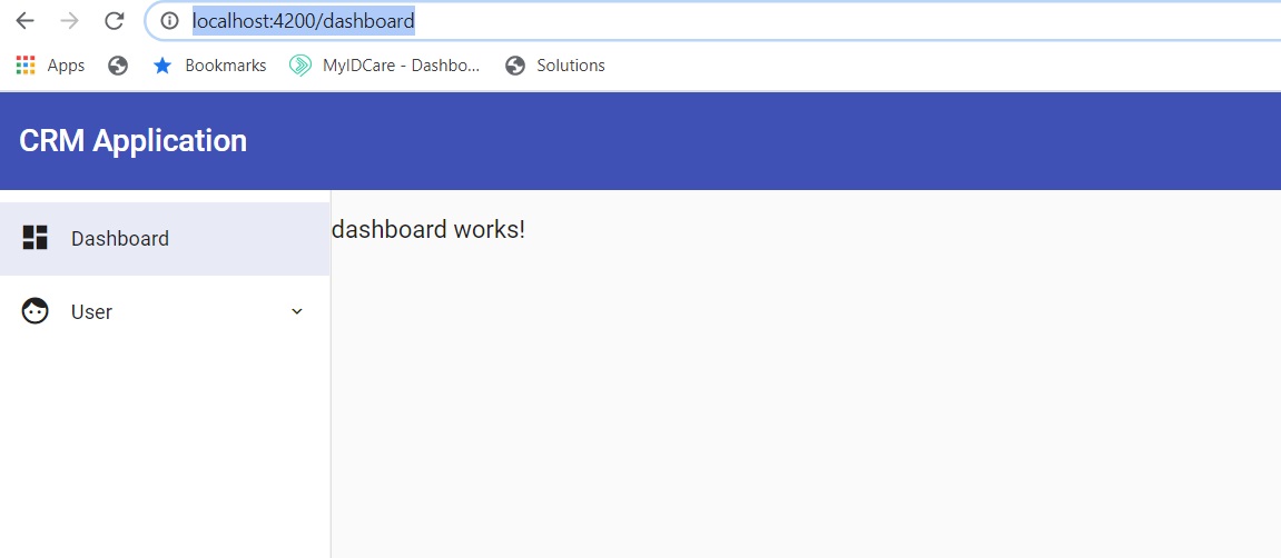
http://localhost:4200/dashboard
You should see something like this:

Brilliant! Off to a great start!
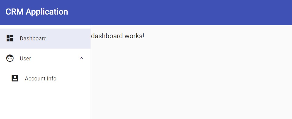
Now, click on the User menu item. It should expand.

Excellent.
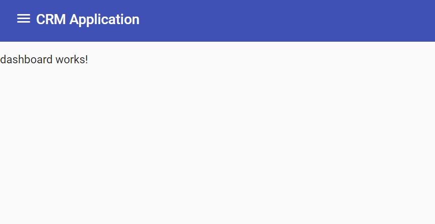
Now, test out the responsiveness of the application. Simply shrink the size of your browser window by making it skinnier.
You should see the sidebar disappear while the menu icon appears in the top bar.

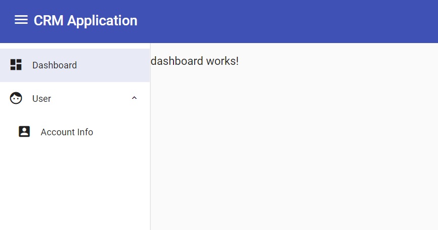
Now click on the menu icon. The sidebar should magically reappear.

Awesome. It would appear that you have a working, responsive sidebar navigation menu.
Wrapping It Up
And there you have it. Now it's your turn to tinker with the code.
See what happens if you add content where it reads "dashboard works!" After all, you'll probably want some actual content in there.
Also, try adding menu items. Pick your own icons.
And just a reminder: if you want to grab the source code, you can do so on GitHub.
Have fun!


