Got an Angular application that requires a responsive form? Follow along and I'll show you how to add one.
With the assistance of Angular Material and Flex-Layout, you can have a slick, responsive form up and running in minutes.
In this guide, I'll explain how to create a login form that looks great on a desktop, laptop, smartphone, tablet, or phablet.
As usual, you're free to check out the code on GitHub rather than read the article if you're low on time.
Remember, though: if you're having problems running the Angular app locally, be sure to check the README.
Please note: this guide is a part of an ongoing series of tutorials on how to create a customer relationship management (CRM) application from scratch. The GitHub code for each guide belongs to a specific branch. The master branch holds the entire application up to the current date. If you want to follow the whole series, just view the careydevelopmentcrm tag. Note that the website displays the guides in reverse chronological order so if you want to start from the beginning, go to the last page.
The Business Requirements
Your boss Smithers walks into your office and tells you that he likes what you've done so far with the CRM app. Specifically, he appreciates the integration with Spring Boot.
"But," he says, "there's no login form! You've implemented a login solution without a form!"
He wants a form.
So you're going to give him one.
Housekeeping
If you're not following along throughout this entire series, you can skip this section.
If you are following along, though, then I need to talk about changes I've put in place since the last guide.
For starters, I've changed the package.json file significantly. It now includes more recent versions of some modules.
What that means for you: if you get the latest code, you might need to blow away everything in your node_modules directory and re-run npm install.
In fact, at this point I'd definitely recommend that.
I've also moved the login component out of the user directory and created a separate module for it.
Why? Because with user logins, you don't want to show top-level and sidebar menus. You want a separate login page with no menus at all.
If you leave the login component in the user module, then you'll have to show the menus because everything that's part of a feature will show the menus. You'll see more about that in a future guide.
I also created a directory called features and made the user directory there. My vision now is to put all feature modules under the features directory.
Finally, I've also decided to use the Flex-Layout module for responsive design instead of coding my own CSS. That means much of the CSS I covered in the very first lesson in this series is no longer necessary.
However, you can still go that route if you want maximum flexibility with your layouts and design. But it will take you longer to get the app up and running.
Okay, let's move on to responsive forms.
Installing the Modules
The first thing you need to do is install a couple of modules. Start by installing Angular Material.
Just go to your command prompt and switch to the base directory of where your source code is located. Then, enter the following:
ng add @angular/material
Select the indigo-pink prebuilt theme. You can see what it looks like here.
Select the defaults for any other prompts you get.
Angular Material provides you with several cool design components that you can easily add to your user interface. It saves you time so you don't have to write a bunch of CSS.
The trade-off with that, of course, is that you're somewhat "boxed in." You'll end up using elements that look great, but also look just like elements used by countless other Angular developers.
But if you want to get an app out the door ASAP, Angular Material will give you what you need.
Next, install Flex-Layout. That's going to help you create a responsive UI that properly lays out your form on any device.
Go to your command prompt again and enter the following:
npm install @angular/flex-layout
Once that's done, you've got the two components you need to create a great login form.
Generating the Module and the Component
As I mentioned in the Housekeeping section, I've moved the login component from the user module and put it in its own module. Here's how you can do that, too.
While still at the command line, create the login module:
ng g m login
Then, create a login component:
ng g c login
Check the state of affairs in your Microsoft Visual Studio IDE and you'll see that you have a login subdirectory under src/app. It should have five files in it that all begin with login.
If you've been following along in this series, then you already have an authentication.service.ts file that you need to move to that same login subdirectory. Go ahead and do that now.
You'll also need to go back and change the routing. Update app-routing.module.ts in src/app and replace the existing login route with this:
{ path: 'login', loadChildren: () => import('./login/login.module').then(m => m.LoginModule) },Okay, now that you've got the framework set up, it's time to start messing around with some code.
Mucking About in the Module
Edit login.module.ts and make it look like this:
import { NgModule } from '@angular/core';
import { CommonModule } from '@angular/common';
import { LoginComponent } from './login.component';
import { RouterModule } from '@angular/router';
import { FlexLayoutModule } from '@angular/flex-layout';
import { MatIconModule } from '@angular/material/icon';
import { MatInputModule } from '@angular/material/input';
import { MatButtonModule } from '@angular/material/button';
import { ReactiveFormsModule } from '@angular/forms';


export const routes = [
    { path: '', component: LoginComponent }
];


@NgModule({
  declarations: [LoginComponent],
  imports: [
      CommonModule,
      FlexLayoutModule,
      MatIconModule,
      MatInputModule,
      MatButtonModule,
      ReactiveFormsModule,
      RouterModule.forChild(routes)
  ]
})
export class LoginModule { }
Pay particular attention to the imports at the top and bottom of the code.
The FlexLayoutModule import gives you the ability to position elements on the page so that they'll move around as needed depending on the size of the screen.
The next three modules (that all begin with "Mat") belong to the Angular Material family. They make it easy for you to add icons, input elements, and buttons to your UI.
And now we get to ReactiveFormsModule. What the heck is that?
With Angular apps and forms, you have two options template-driven forms and reactive forms.
I've decided to go with reactive forms for this application because:
- Reactive forms are more scalable
- They're better suited to complex scenarios
- They're better suited to unit testing
Also, the source of truth for reactive forms remains in the model rather than in the template. I've always preferred that approach.
Templte-driven forms, while they're easier to use, are really a relic of Angular 1. I think most developers prefer to go the reactive route these days.
Anyhoo, that ReactiveFormsModule import enables you to create an online form that handles input, validation, and submission. And that's exactly what you'll be doing with that login form.
The Login Component
More fun stuff! Now it's time to add some code to login.component.ts.
I'll go over the code in bite-sized chunks.
import { Component, OnInit } from '@angular/core';
import { AuthenticationService } from './authentication.service';
import { FormGroup, FormBuilder, Validators } from '@angular/forms';


@Component({
  selector: 'app-login',
  templateUrl: './login.component.html',
    styleUrls: ['./login.component.css']
})
Once again, look at the imports.
AuthenticationService is the glue the binds the Angular app with the Spring Boot service. It's the part that connects with the back end.
You've seen it before in previous guides.
The last line of imports might be new to you as well. Those three classes support form-related tasks.
FormGroup lives up its name. It represents a group of related fields that make up a form.
FormBuilder makes it easy for you to create a FormGroup.
And you'll use the Validators import to... surprise!... validate the inputs.
The @Component decorator for this class is standard fare.
Next few lines of code:
export class LoginComponent implements OnInit {
    form: FormGroup;
    formSubmitted: boolean = false;

    constructor(private fb: FormBuilder, private authenticationService: AuthenticationService) { }

    ngOnInit() {
        this.form = this.fb.group({
            'username': ['', Validators.compose([Validators.required])],
            'password': ['', Validators.compose([Validators.required])]
        });
    }
First of all, the code declares two members: form and formSubmitted.
The form member is the model backing the login form on the user interface. I'll go over that in more detail in a moment.
The formSubmitted member is a simple boolean that indicates whether the user submitted the form. It defaults to false because when the page first loads the user has obviously not submitted the form yet.
The constructor injects two dependencies: FormBuilder and AuthenticationService.
I've already covered AuthenticationService in previous guides and even explained it briefly here. So I'll just cover FormBuilder in some detail.
In a nutshell, FormBuilder offers convenience. It makes your life easier by reducing the amount of typing you need to do to create an a FormGroup object.
If you look down a few lines, you'll see the FormBuilder method the code uses here is group(). As the name implies, that creates a new FormGroup instance.
And what goes into that instance? Two fields: username and password.
For each one of those fields, you see an assignment that looks like this:
['', Validators.compose([Validators.required])]So what's that all about?
The empty string in the first element of the array represents the default value. Since it's an empty string, the fields on the page will show up empty as well.
The next element in the array creates the validators for the field. Each field comes equipped with one validator: Validators.required.
That means the field is required. The user must put something in that field or the whole form isn't valid.
By the way, the FormGroup object that gets created from the group() method gets assigned to the form member that you see towards the top of the class.
The application will reference that form object not only from within this class, but from the template as well.
Next, take a look at the onSubmit() function:
    onSubmit(loginForm) {
        this.formSubmitted = true;

        if (this.form.valid) {
            let username = this.form.controls['username'].value;
            let password = this.form.controls['password'].value;

            let user$ = this.authenticationService.login(username, password);

            user$.subscribe(
                (data: any) => console.log(data),
                err => console.error(err)
            );
        } else {
            console.log("The form is NOT valid");
            this.formSubmitted = false;
        }
    }
First of all, the function takes on argument: the form itself. If you log that loginForm object, you'll see it's just a JSON object with two properties username and password.
However, if you scroll down the method you'll see that the code doesn't use it anywhere. Why is that?
Because those same values are bound to the form member variable. So we get them for free without the parameter.
The first thing that function does is set the formSubmitted boolean to true. That's important because the template side can take action based on that boolean.
What action would it want to take? It can disable the Login button so the user doesn't submit the form again while the first submission is still processing.
And that's exactly what it will do. As you'll see.
Next, the function checks to see if the form is valid. Remember: each field must be filled out for the form to be valid.
If the form is valid, the code sets a couple of local variables (username and password) based on the user inputs.
The next few lines of code will be familiar if you've followed the series. That block uses AuthenticationService to authenticate the user on the Spring Boot side.
If the credentials are good, the service will return the JSON web token that the remote service generated.
The else block at the bottom gets executed if the form isn't valid. In that case, the app just logs a line saying that the form isn't valid.
Then, it sets the formSubmitted boolean back to false so the user can try again.
Adding Some Assets
You don't want a boring login page, do you?
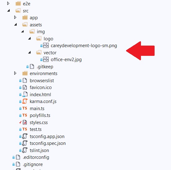
If not, then you need to add some pretty pics. I've taken the liberty of adding my logo and a sample of vector graphics artwork I picked up from freepik.
I added both of those images under the assets directory in /src.
You can see them here:

You can grab them yourself from the img folder on GitHub.
Updating the CSS
Next, it's important to update the CSS. Take a look at styles.css in the /src directory.
Make sure you've got these lines in that file:
.mat-form-field-flex {
  background-color: #ffffff !important;
}
That gives our form fields a white background. I prefer that over a transparent background.
You have to include !important because the CSS that styles the Angular Material element gets loaded after the style you see above. So it would override that style if you didn't add !important.
Touching the Template
Now, it's time to add some HTML to login.component.html. I'll go over this in small bits as well.
Here's the first line:
<div fxFlex fxLayout="column" fxLayoutGap="0px">
All those attributes are really directives. They belong to Flex-Layout.
By the way, that's the parent element of the whole page. Everything on the page is a child (or descendant) of that element.
The fxFlex directive specifies info about sizing.
It's often the case you'll see something like fxFlex="30%" or fxFlex="100px". But when you don't specify any value it defaults to 100%.
So that element takes up the entire width of the screen.
The fxLayout directive specifies how the child elements will appear (in rows or columns). Here, I've decided to use columns.
Why? Because, historically, the web lays out elements top to bottom.
Website visitors don't scroll a page from left to right. They scroll it from top to bottom.
In this case, I only have one child element. And I'll use it to create a responsive row.
A row within a column? Yep. Get used to that with Flex-Layout.
Finally, that fxLayoutGap directive specifies the spacing between elements. I've set it to 0px (or no spacing) here.
Here's the next line:
<div fxLayout="row wrap">As I teased earlier, the next <div> element aligns its children in a row instead of a column. But what's that wrap thing?
That's an important part of responsive design. That code tells the application to wrap the elements if there isn't enough room on the screen.
Effectively, it turns the row into a column.
And here's the next line:
<div fxFlex="50" fxFlex.lt-md="100" fxLayout="column">Some of that you might be able to figure out on your own.
The fxFlex directive here is assigned a value of 50. What exactly is that.
It's a percentage by default. So that means the element takes up 50% or half the screen.
But not so fast. Why are there two fxFlex directives.? And why does the other one have a .lt-md attached to it?
That .lt-md means "less than a medium-sized screen." So if it's a small screen then the value assigned to fxFlex is 100 or 100%.
In other words, you want the element to take up the whole width of the screen if the user is loading the page on a device with a small screen.
So on large screens you'll see the element side-by-side with the other element. But on smaller screens you'll see the element on top of the next element.
That's the nature of responsive development.
I think we can tackle the children elments in one fell swoop:
      <div fxLayoutAlign="center">
        <img style="margin-top:30px" src="/assets/img/logo/careydevelopment-logo-sm.png" />
      </div>

      <div fxLayout="row" fxLayoutAlign="center">
        <h2 style="margin-top:100px" class="my-primary-text">CRM App</h2>
      </div>

      <div fxLayout="row" fxLayoutAlign="center">
        <img src="/assets/img/vector/office-env2.jpg" />
      </div>
There are three child elements. You can see them spaced apart for easy readability above.
The first one displays my logo. I've added some inline styling so the logo doesn't run up against the very top of the page.
The next child displays the words CRM App. That's the unimaginative title of the app itself.
The final child displays the vector graphic. It's a cute office pic that just adds a little fun to the UI.
Okay, let's look at the other element in the row:
    <div fxFlex="50" fxFlex.lt-md="100" fxLayout="column" class="mat-app-background">
      <div fxLayout="column" fxLayoutAlign="center" style="margin-top:30px">
        <div fxLayout="row" fxLayoutAlign="center">
          <h3>Welcome to the CRM App</h3>
        </div>

        <div fxLayout="row" fxLayoutAlign="center">
          <h4>Please sign in below</h4>
        </div>
      </div>
In the top element, take a look at the class="mat-app-background" attribute. That gives you the background color from the Angular Material theme you're using (that would be the indigo-pink theme, remember?).
The child elements below should look somewhat familiar. They follow the same pattern you saw just above.
Now, let's take a look at the form itself:
      <div fxLayout="column" fxLayoutAlign="center" style="margin-top:100px">
        <form [formGroup]="form" (ngSubmit)="onSubmit(form.value)">
          <div fxLayoutAlign="center">
            <mat-form-field style="width:50%" appearance="fill">
              <mat-label>Enter username</mat-label>
              <input formControlName="username" matInput>
              <mat-error *ngIf="form.controls['username'].invalid">Please enter a valid username</mat-error>
            </mat-form-field>
          </div>
          <div fxLayoutAlign="center" style="margin-top:10px">
            <mat-form-field style="width:50%" appearance="fill">
              <mat-label>Enter password</mat-label>
              <input type="password" formControlName="password" matInput>
              <mat-error *ngIf="form.controls['password'].invalid">Please enter a valid password</mat-error>
            </mat-form-field>
          </div>
          <div fxLayoutAlign="center" style="margin-top:20px">
            <button [disabled]="!form.valid || formSubmitted" type="submit" mat-raised-button color="primary">Login</button>
          </div>
        </form>
      </div>
For starters, the form displays in a column format. That means the username field appears on top of the password field (and not to the right or left of it).
Now take a look at the <form> element. That's where the fun starts.
The code binds formGroup to the form object in login.component.ts. Changes to the form in the UI will get reflected to the form object in the class.
Next, the code binds the submit event (ngSubmit) to the onSubmit() function in login.component.ts. You saw that function earlier.
Look below the <form> element and you'll see two input fields aligned vertically. They're the username and password fields, respectively.
Take a closer look at the input for username:
            <mat-form-field style="width:50%" appearance="fill">
              <mat-label>Enter username</mat-label>
              <input formControlName="username" matInput>
              <mat-error *ngIf="form.controls['username'].invalid">Please enter a valid username</mat-error>
            </mat-form-field>
The <mat-form-field> element, as you might have guessed, belongs to the Angular Material family.
Here, it's styled so it takes up half the width of the parent element (that's the width:50% part you see).
That appearance attribute tells Angular Material to fill the input element. Usually, it would fill it with a dark grey color.
Ah, but remember the CSS from above:
.mat-form-field-flex {
  background-color: #ffffff !important;
}
That forces the fill to appear white instead of grey.
The <mat-label> element, look so many other things I've shared with you in the guide, is intuitively named. It's where you enter the label of the field.
In this case, the label will appear inside the field itself as a placeholder. I like that setup because it gives the app more digital real estate on the screen.
The <input> element doesn't belong to Angular Material. It's part of the standard HTML portfolio of elements.
The formControlName directive is also not part of Angular Material. Nor is it part of HTML.
It's part of Angular.
Specifically, the formControlName directive binds the <input> element to a specific field on the form object in login.component.ts.
So formControlName="username" corresponds to this line in login.component.ts:
'username': ['', Validators.compose([Validators.required])]Remember that?
Now that field is associated with an element on the user interface.
The matInput directive simply allows the <input> element to work with <mat-form-field>.
Next, <mat-error> displays the message that appears in the event of a form validation error.
That *ngIf thing you see is what the Angular creators call a structural directive. That's because it affects what appears on the screen.
In this case, if that boolean in the *ngIf expression evaluates to false, then the whole element disappears.
If it evaluates to true, though, then users will see the message: "Please enter a valid username."
Note that <mat-error> styles the element so you don't have to do anything with that. It will appear in red.
Okay, now that I've explained the first field (username), I think you can figure out the second field (password) all by yourself.
Finally, take a look at the button code:
          <div fxLayoutAlign="center" style="margin-top:20px">
            <button [disabled]="!form.valid || formSubmitted" type="submit" mat-raised-button color="primary">Login</button>
          </div>
Like so many other elements here, the <button> element is a child of a Flex-Layout element.
Also, if you look at the element itself, you'll see that it could be disabled. It will be unpressable if that boolean evaluates to true.
So what's the boolean? Well it's in two parts separated by an or (||).
The first part evalutes to true if the form isn't valid (!form.valid). That's the same form object, by the way, that's a member of login.component.ts.
The second part evaluates to true if the user submitted the form by pressing the button. That formSubmitted boolean is also a member of login.component.ts.
The mat-raised-button directive is part of Angular Material. It gives the button its styling.
Updating the Routing
One more thing you'll need to do before you can test this out: update the routing.
Edit app-routing-module.ts in src/app. It should look like this:
import { NgModule } from '@angular/core';
import { Routes, RouterModule } from '@angular/router';


const routes: Routes = [
    { path: '', pathMatch: 'full', redirectTo: 'home' },
    { path: 'home', loadChildren: () => import('./home/home.module').then(m => m.HomeModule) },
    { path: 'login', loadChildren: () => import('./login/login.module').then(m => m.LoginModule) },
    { path: 'features', loadChildren: () => import('./features/features.module').then(m => m.FeaturesModule) }
];

@NgModule({
    imports: [
        RouterModule.forRoot(routes)
    ],
    exports: [RouterModule],
    providers: []
})
export class AppRoutingModule { }
The big change there is the login path. It wasn't specified at this level before. It was part of the user module.
What's It Look Like?
Okay, now it's time to see the code in action.
Launch the application with the usual ng serve command. Then visit the following URL:
http://localhost:4200/login
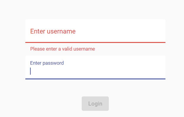
You should see something that looks like this:

So that's what all this hard work you've done has produced. Not bad!
First off, notice that the Login button is greyed out. Why is that?
Remember: it's disabled if the form isn't valid. And the form is only valid if the user put something in both of the fields.
Here's another test you can do: click on the username field and then click on the password field without entering anything. You should see this:

That's pretty cool! Angular Material gives you instantaneous validation!
Integration Testing
Thus far, the UI looks pretty solid. But what about the integration.
You're going to test that out now.
(Once again, you can skip this section if you haven't been following along in the series.)
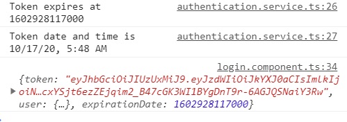
For starters, make sure you've got your Developer console showing on the right-hand side of the screen. If not, bring that up now.
Fire up your Spring Boot User application. Then enter "darth" as the username and "thedarkside" as the password (sans quotes). Click the Login button.
Take a look at the Developer console and you should see this familiar sight:

That means you've successfully logged in. Congrats!
Wrapping It Up
Now that you know how to implement a responsive login form, do some experimenting.
Add more fields. Create other types of forms. Use different layouts.
Make the application your own!
And remember, you can always grab the code on GitHub.
Have fun!


