Need to override an SCSS variable in your Bootstrap application but you're not sure about its name?
Relax. I'll show you how to do it here.
In fact, I'll give you a couple of options. And I think you'll have everything you need to complete that override once you're done reading this article.
So let's get started.
View the Variables
One of the best ways to familiarize yourself with the Bootstrap variables is to look at the _variables.scss file.
Yeah. It's got a pretty good name, doesn't it?
Anyhoo, if you're using Bootstrap with Angular then you'll find that _variables.scss file in the node_modules/bootstrap/scss directory off the root of your source tree. You'll probably need to search for it using the operating system as your IDE might not display node_modules.
Here's a small sampling of what that file looks like:
$navbar-nav-link-padding-x:         .5rem !default;

$navbar-brand-font-size:            $font-size-lg !default;
// Compute the navbar-brand padding-y so the navbar-brand will have the same height as navbar-text and nav-link
$nav-link-height:                   $font-size-base * $line-height-base + $nav-link-padding-y * 2 !default;
$navbar-brand-height:               $navbar-brand-font-size * $line-height-base !default;
$navbar-brand-padding-y:            ($nav-link-height - $navbar-brand-height) * .5 !default;
$navbar-brand-margin-end:           1rem !default;

$navbar-toggler-padding-y:          .25rem !default;
$navbar-toggler-padding-x:          .75rem !default;
$navbar-toggler-font-size:          $font-size-lg !default;
$navbar-toggler-border-radius:      $btn-border-radius !default;
$navbar-toggler-focus-width:        $btn-focus-width !default;
$navbar-toggler-transition:         box-shadow .15s ease-in-out !default;
// scss-docs-end navbar-variables

// scss-docs-start navbar-theme-variables
$navbar-dark-color:                 rgba($white, .55) !default;
$navbar-dark-hover-color:           rgba($white, .75) !default;
$navbar-dark-active-color:          $white !default;
$navbar-dark-disabled-color:        rgba($white, .25) !default;
$navbar-dark-toggler-icon-bg:       url("data:image/svg+xml,<svg xmlns='http://www.w3.org/2000/svg' viewBox='0 0 30 30'><path stroke='#{$navbar-dark-color}' stroke-linecap='round' stroke-miterlimit='10' stroke-width='2' d='M4 7h22M4 15h22M4 23h22'/></svg>") !default;
$navbar-dark-toggler-border-color:  rgba($white, .1) !default;
As you can see, the variables have intuitive names ($navbar-dark-color). Also, blocks of related variables are prefaced by comments that give you even more info.
So chances are pretty good that you might get exactly what you need by going through that _variables.scss file and searching for a variable name relevant to what you're doing.
That's one way to go about it.
A Sneak Peek
Another way you can see which SCSS variables a Bootstrap class is using is by taking a sneak peek while inspecting the element.
I'll show you how to do that with Google Chrome.
Fire up the browser and navigate to your Bootstrap-ified page. Then, open up Dev Tools.
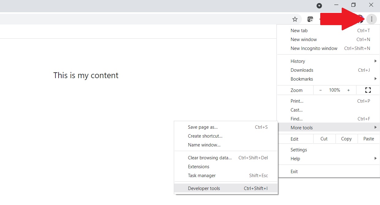
You do that by clicking on the three dots in the upper, right-hand corner of the screen. Then, select More Tools from the menu and Developer Tools from that submenu as shown here:

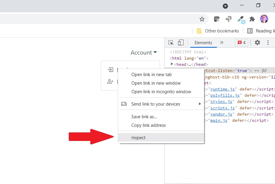
Next, highlight the element on the page you want to inspect. Or just right-click on it and select Inspect from the menu that appears.

In the example above, I'm inspecting the Login link from the dropdown menu under Account.
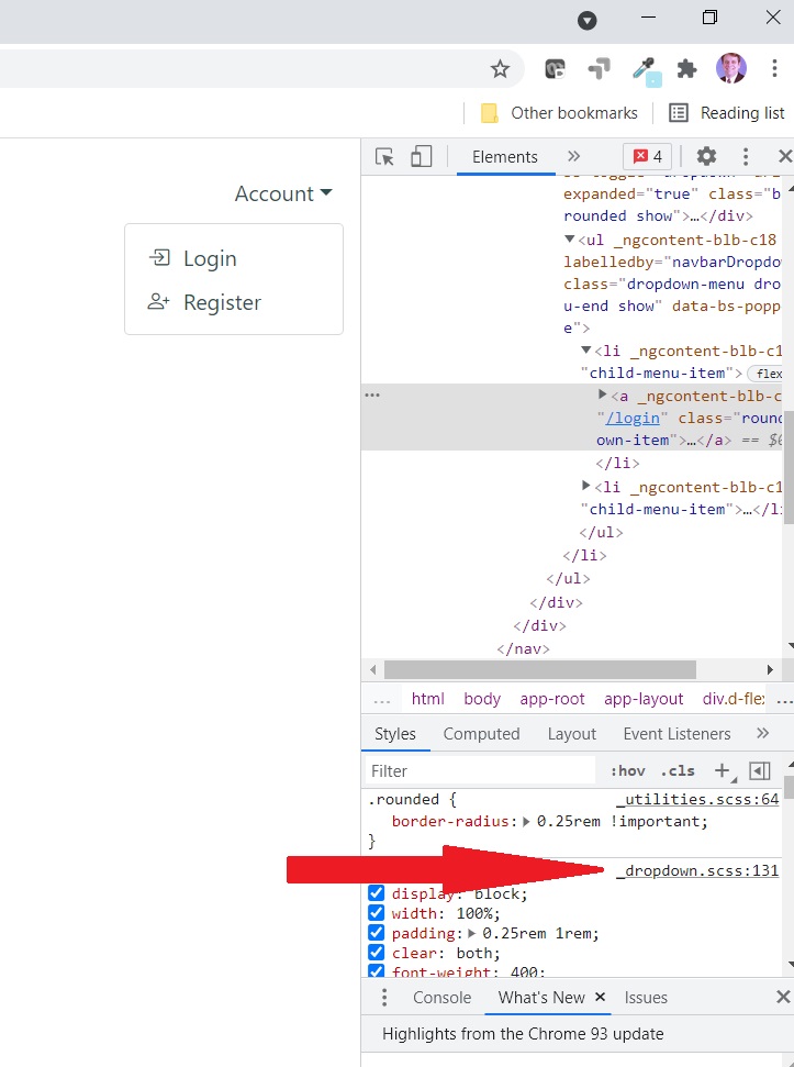
Now take a look at the content in the right-hand sidebar. Click the relevant SCSS link next to the class property that you're interested in. For example:

I'm clicking on _dropdown.scss. That's going to open up yet another window in the right-hand sidebar.

And in that window, I can clearly see that the color property for that class is set to the value of the SCSS variable $dropdown-link-color.
Again: it's intuitively named. So I probably could have found that by searching around in _variables.scss.
But that's another option if you think it will take too long to fish around in the _variables.scss file.
So now all I need to do is override $dropdown-link-color in my own SCSS file and I can set that link color to whatever I want.
You can do the same.
If you're unsure how to override Bootstrap's default colors, feel free to read my guide on the subject.
Wrapping It Up
That's it. That's all you need to do to identify Bootstrap SCSS variables.
Now it's up to you to use one of the above methods and make the UI changes you know your users will love.
Have fun!
Photo by Max Vakhtbovych from Pexels


