Looking to use Angular as your UI framework? If so, you'd be better be ready to make sure your layout looks great on any device.
Fortunately, you can do that with cascading stylesheets (CSS).
And yes, Angular lets you add CSS to your source base so that your application is responsive. That means it responds to any screen size, whether it's a huge monitor or a skinny smartphone.
Truth be told, if you aren't developing user interfaces that work well with mobile platforms, then your app isn't ready for the 21st century.
In this guide, I'll go over how to create an Angular application from scratch. I'll also cover how to make sure it's responsive.
By the way, this guide is the first in a series. I'm going to create an entire customer relationship management (CRM) application from scratch. And you can follow along.
I have no idea how long I'll keep this up. Maybe I'll get too busy to finish it. Maybe I'll get bored and just stop doing it.
Who knows?
But for now, let's press on.
As always, feel free to grab the code on GitHub if you're one of those TL;DR types.
Remember, though: if you're having problems running the Angular app locally, be sure to check the README.
The Business Requirements
Your boss Smithers walks into your office and says he's got a new assignment for you. He needs you to develop a CRM.
"However," he says with his finger in the air, "you've got to make sure it works on desktop and mobile platforms."
In other words, it needs to be responsive. See above.
Oh, yeah. Smithers is into microservices these days so he wants you to develop the UI for the new application with this framework that he calls "Angler."
You know what he means.
He leaves your office thinking he educated you.
Getting Started With Angular
The first thing you need to do is get Node.js on your system. Fortunately, you get the npm client for free with that download. You'll need that later.
Next, you need the Angular command line interface (CLI). Now that you have Node.js, just open an MS-DOS window (yes, I'll assume you're using Windows for local development) and enter the following command:
npm install -g @angular/cli
That one might take a bit (get used to waiting with Angular work unless you have a really powerful system). But once it's done, you're all set.
Now, it's time to create an Angular project from scratch.
Creating a Project
While still in the MS-DOS window, situate your cursor in a directory where you like to keep up with source control. Then, enter the following command:
ng new careydevelopmentcrm
Accept the default answer at all input prompts. If there's anything you need to change, you can take care of it later.
Once again, though, the whole process will take a while.
Don't worry if you see some warnings/errors along the way. You can take care of those at some point in the future.
When everything is said and done, you should have a new directory named careydevelopmentcrm. It will be populated with lots of files.
You don't need to worry about what all those files do at this point. You just need to get a bare-bones Angular app up and running.
And, believe it or not, you did just that.
While still at your MS-DOS prompt, enter the following:
ng serve
That will launch your Angular server so you can see your application in action.
Fire up a browser and hit this URL:
http://localhost:4200/
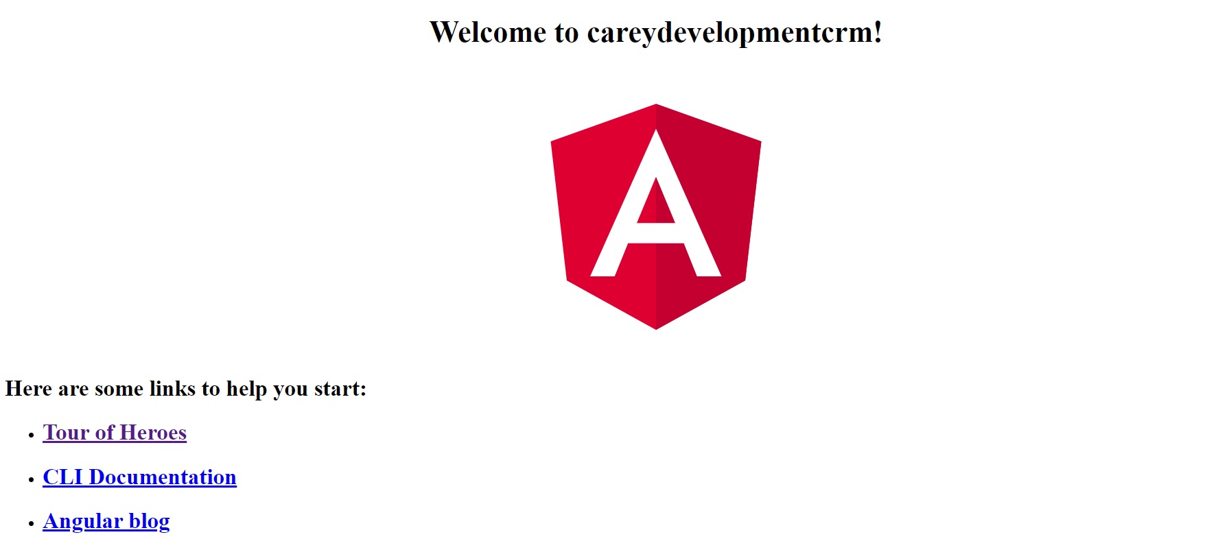
You should see something that looks like this:

Congratulations! You just created an Angular app!
If only the rest of the application were that easy!
Customization
Well that's not exactly your own app, is it? Time to start adding some custom elements.
It's also a great idea to add the stylesheet that handles responsive behavior at this time as well. Why not do that now?
But first, you need an integrated development environment (IDE). For the purposes of this guide (and all future guides on this subject), I've chosen to use Microsoft Visual Studio.
Why? It works well with front-end code (like Angular). It also plays nicely with Git repositories like GitHub and Bitbucket.
So I think you should use it as well.
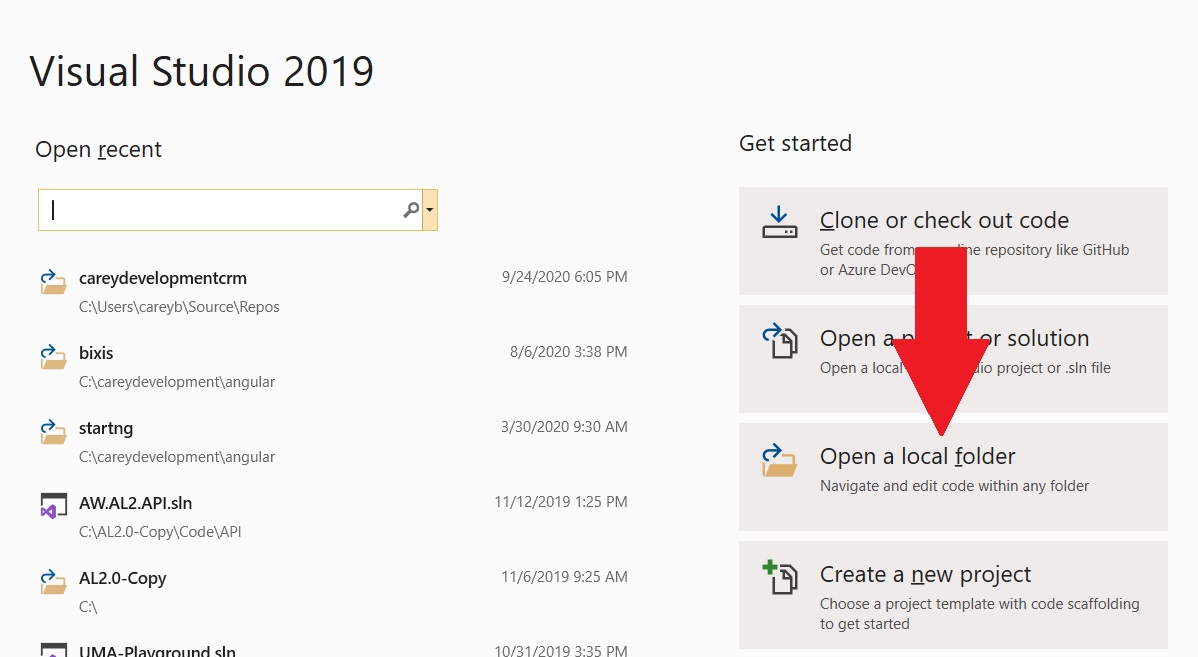
Go ahead and fire up Visual Studio. When you see the intro screen, select Open a local folder.

Then, navigate the careydevelopmentcrm folder.
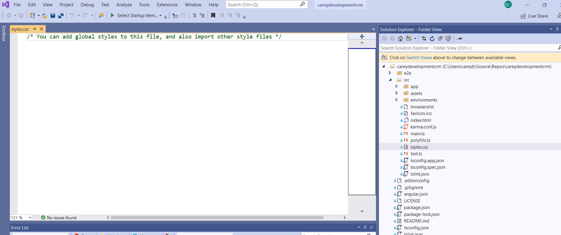
Here's a screen grab of what I'm looking at in my IDE:

All of my Angular-specific files are on the right-hand side. The editor shows the styles.css file that I'll go over in a moment.
If you're not seeing what I'm seeing, you may need to select Solution Explorer instead of Team Explorer at the bottom of the right-hand column.
Sidebar: I strongly recommend you get your code in a Git repository at this point. It's a little outside the scope of this guide to go into detail on that. Fortunately, it's pretty easy.
Okay, now it's time to add some responsive styling to this bad boy.
The CSS File
I'm not going to cover the entire CSS file here. I'll just go over the parts that relate to responsive design.
But first, a quick primer on how modern-day websites handle responsive behavior.
It all begins with a 12-column layout. Elements on the page take up one or more of those columns.
Let's say you have three elements side-by-side. They each take up four columns. That's simple: three elements x four columns = 12 columns total.
So those three elements would fill up the entire width of the web page.
At least on a desktop or laptop monitor. What happens on a smartphone?
Well, in that case, the elements wouldn't lay out horizontally. Instead, they'd lay out vertically.
The first element would take up the whole screen. The user would scroll down a bit to see the second element. That would also take up the whole screen. And the third element would appear just below the second element, also taking up the entire width of the screen.
That's the essence of responsiveness. The web application shifts elements around as needed to create a user-friendly UI.
Now that you've got the basics., it's time to start adding code.
The first thing you put in the stylesheet is this line:
* {
  box-sizing: border-box;
}
That ensures all elements include padding and border in their widths and heights.
Next, define the 12 columns based on screen sizes:
@media only screen and (min-width: 600px) {
  .col-sm-1 {width: 8.33%;}
  .col-sm-2 {width: 16.66%;}
  .col-sm-3 {width: 25%;}
  .col-sm-4 {width: 33.33%;}
  .col-sm-5 {width: 41.66%;}
  .col-sm-6 {width: 50%;}
  .col-sm-7 {width: 58.33%;}
  .col-sm-8 {width: 66.66%;}
  .col-sm-9 {width: 75%;}
  .col-sm-10 {width: 83.33%;}
  .col-sm-11 {width: 91.66%;}
  .col-sm-12 {width: 100%;}
}

@media only screen and (min-width: 768px) {
  .col-md-1 {width: 8.33%;}
  .col-md-2 {width: 16.66%;}
  .col-md-3 {width: 25%;}
  .col-md-4 {width: 33.33%;}
  .col-md-5 {width: 41.66%;}
  .col-md-6 {width: 50%;}
  .col-md-7 {width: 58.33%;}
  .col-md-8 {width: 66.66%;}
  .col-md-9 {width: 75%;}
  .col-md-10 {width: 83.33%;}
  .col-md-11 {width: 91.66%;}
  .col-md-12 {width: 100%;}

  .footer {
    height: 100px;
  }
}

@media only screen and (min-width: 992px) {
  .col-lg-1 {width: 8.33%;}
  .col-lg-2 {width: 16.66%;}
  .col-lg-3 {width: 25%;}
  .col-lg-4 {width: 33.33%;}
  .col-lg-5 {width: 41.66%;}
  .col-lg-6 {width: 50%;}
  .col-lg-7 {width: 58.33%;}
  .col-lg-8 {width: 66.66%;}
  .col-lg-9 {width: 75%;}
  .col-lg-10 {width: 83.33%;}
  .col-lg-11 {width: 91.66%;}
  .col-lg-12 {width: 100%;}
}

@media only screen and (min-width: 1200px) {
  .col-xl-1 {width: 8.33%;}
  .col-xl-2 {width: 16.66%;}
  .col-xl-3 {width: 25%;}
  .col-xl-4 {width: 33.33%;}
  .col-xl-5 {width: 41.66%;}
  .col-xl-6 {width: 50%;}
  .col-xl-7 {width: 58.33%;}
  .col-xl-8 {width: 66.66%;}
  .col-xl-9 {width: 75%;}
  .col-xl-10 {width: 83.33%;}
  .col-xl-11 {width: 91.66%;}
  .col-xl-12 {width: 100%;}
}
The @media rule specifies various screen widths. The last section, for example, specifies screen widths that are 1200px wide or larger.
For the purposes of this app, that's an extra large screen. That's why you see xl in each of the class definitions.
If you look at the rest of the blocks above, you'll see that the code defines, small, medium, large, and extra large screen sizes.
Why is that necessary? Go back to the example above.
For a small screen size, you want that four-column element to take up the entire screen width. But on a large screen size, you just want it to take up 1/3 of the screen width.
So when you create the element in HTML, you might use code that looks like this:
<p class="col-xl-4 col-sm-12">Hi there</p>See what's going on there? The code is using two different classes for the same element: col-xl-4 and col-sm-12.
That means you're giving the application the following order: "When the user is viewing this on a large screen, I want this element to take up only four columns but when the user is viewing it on a small screen I want this element to take up 12 columns."
And remember: 12 columns is the whole width of the page. So the element will fill the width of the screen.
But wait! There's still more CSS required:
[class*="col-"] {
  width: 100%;
  float: left;
  padding: 15px;
}
That pushes all columns to the left and inserts a padding of 15 pixels. That padding will prevent the elements from running up against each other.
Then you need this:
.row::after {
  content: "";
  clear: both;
  display: table;
}
You already know that the app uses columns. The code above defines a row.
The snippet dictates what happens after each row. It creates some empty content and clears the layout to prevent elements from sitting to the left or right of it.
In other words, it makes a row.
And since you're undoubtedly going to have some images somewhere in the app, you should add this bit of code as well:
img {
  max-width: 100%;
  height: auto;
}
That means the image will scale vertically to fit the element size. But it will never scale larger than it soriginal size.
And now this snippet should be fairly obvious:
video {
  max-width: 100%;
  height: auto;
}
So there you have it. A good start at responsive design.
Now, it's time to test it out.
Updating the Home Page
Create a home page for the app. Then, lay out elements on the home page so they look great on either a desktop or a mobile platform.
That's your mission, should you choose to accept it.
While in your IDE, edit the src/app/app-component.html file.
Substitute the entire file with these contents:
<div class="col-md-4">
  <h1>A Great Site Is Coming</h1>
  <p>This will be better than anything you've ever seen.</p>
</div>

<div class="col-md-4">
  <h1>In Fact, It Will Happen Sooner Than You Think</h1>
  <p>Be on the look for it or you might miss it.</p>
</div>

<div class="col-md-4">
  <h1>Why Not Get Ready?</h1>
  <p>You will appreciate what you see. I guarantee it.</p>
</div>
If you're an astute observer, you'll notice that the code creates three sets of four columns. Just like the examples you saw earler.
In this case, the code is defaults to four columns for a medium-sized screen. For many cases, you can get away with specifying just the layout of medium-sized screens.
Once you've saved that change, go back to your browser. If ng serve is still running from the command line, you'll see your changes take effect instantly.
Yep. That's one of the cool things about Angular development. You don't have to redeploy once you've made changes.
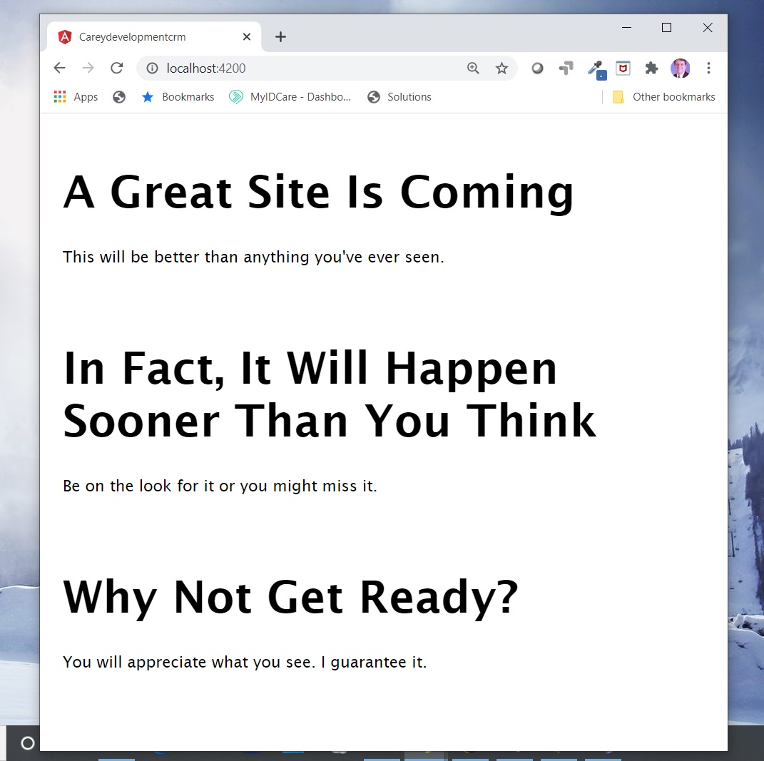
Here's what your screen should look like:

Okay. That's pretty cool. But is it responsive?
Fortunately, you can test that very easily. Just resize your browser window.
Seriously. Just make the width smaller.
You should see something like this:

Look at that! The layout changed based on the screen size!
Congratulations! You've laid the groundwork for a responsive Angular application.
Wrapping It Up
Take what you've learned to the next level. Add some images to the home page. Use six columns instead of four. Embed a video player.
And, as always, feel free to check out the code on GitHub. Fork it, clone it, and mess around as you see fit.
Have fun!
Photo by Andrea Piacquadio from Pexels


