Some people like a dark theme. Others like a light theme.
Some folks want a horizontal menu at the top. Others want a vertical sidebar.
How can a developer make everybody happy?
Well, a developer can't make everybody happy.
That's why it's a great idea to give your users choices. Let them pick the color scheme, layout, menu style, and more.
And let them do it easily.
In this guide, I'll show you how to get started with an Angular/Bootstrap application that enables users to configure their own layouts.
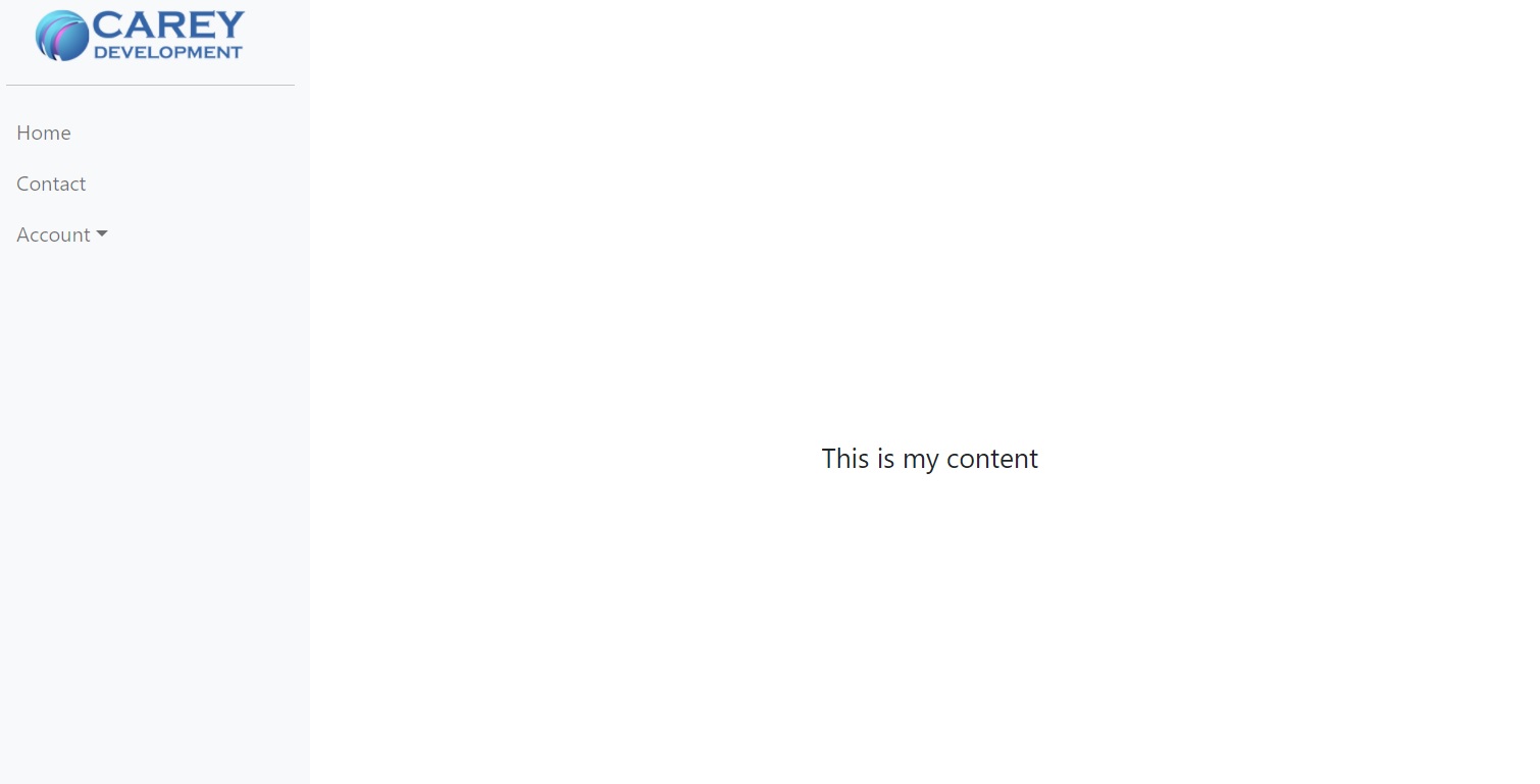
So, for example, users who want a vertical menu will see this:

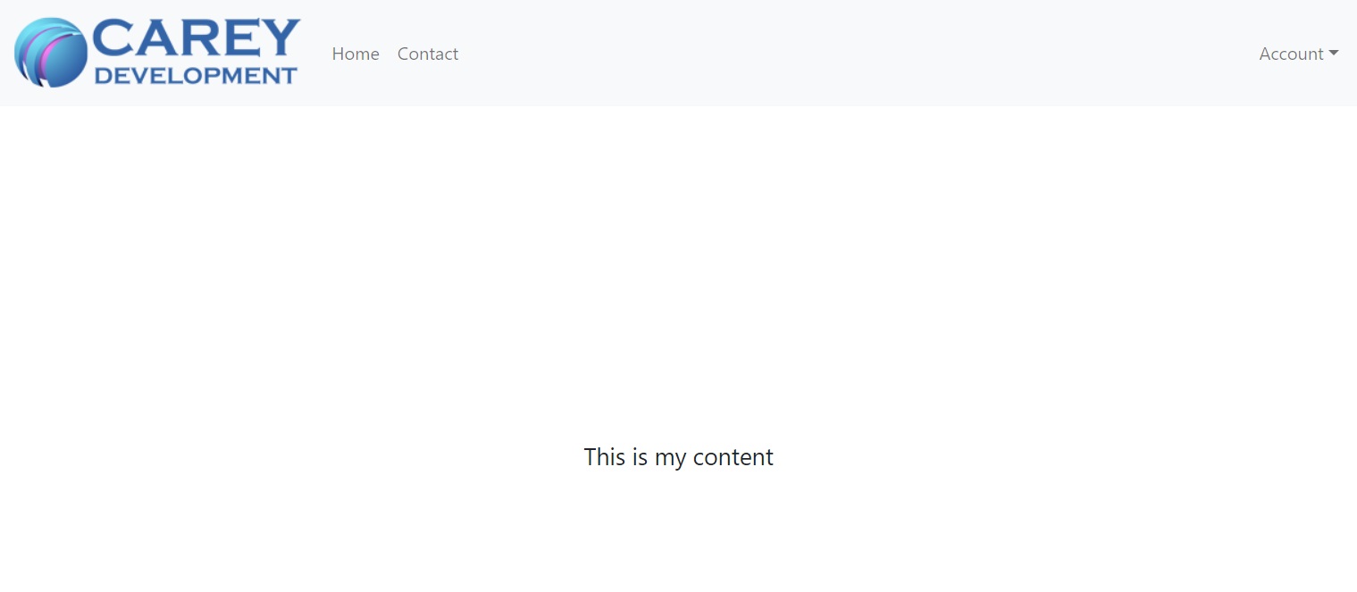
But if they want a horizontal menu, they'll see this:

And they can switch it up with just one simple setting.
Follow along to learn more.
Note: this article is part of a series of tutorials on how to create an admin console using Angular and Bootstrap. Feel free to check out the whole thing if you want to follow from the beginning. Just remember that the articles are sorted by date in descending order so the first article is actually the last.
You can follow along here or take a look at the code on GitHub.
Updating the App Stuff
First, wire up that Angular application you're working on with a router. If you're following the series, you probably didn't do that yet.
I won't go into extensive details about how to create a lazy-loading router here, because I've already done that elsewhere.
Start by creating a new file called app-routing.module.ts at the same level as app.module.ts. Make it look like this:
import { NgModule } from '@angular/core';
import { Routes, RouterModule } from '@angular/router';

export const routes: Routes = [
  {
    path: '',
    loadChildren: () =>
      import('./_layout/layout.module').then((m) => m.LayoutModule),
  }
];

@NgModule({
  imports: [RouterModule.forRoot(routes)],
  exports: [RouterModule],
})
export class AppRoutingModule {}
Basic routing stuff, but totally necessary for the configuration code you're working on.
You probably see an error. We'll take care of it in a minute.
And now make sure you import it in app.module.ts:
import { BrowserModule } from '@angular/platform-browser';
import { NgModule } from '@angular/core';
import { AppRoutingModule } from './app-routing.module';

import { AppComponent } from './app.component';

@NgModule({
  declarations: [
    AppComponent
  ],
  imports: [
    BrowserModule,
    AppRoutingModule
  ],
  providers: [],
  bootstrap: [AppComponent]
})
export class AppModule { }
Finally, put the router outlet in app.component.html:
<router-outlet></router-outlet>Fixing That Error
As I noted above, you got an error. That's because the LayoutModule that you reference in the code above doesn't yet exist.
So go ahead and fix that.
Off of src/app, create a new directory called _layout.
Why the underscore? Because it's a configuration item. And that keeps it towards the top of the source tree.
Now switch to that _layout directory and create a new module from the command line:
ng g m layoutThat should get rid of the error but you still need to create a component:
ng g c layoutThat component is going to hold your layout. Hence the name.
The TypeScript part of the component will read layout configuration info as dictated by the user and set local variables accordingly.
The template part of the component will read those variables and and structure the layout based on their values.
So the layout template will hold the sidebar (if it exists), the top menu (if it exists), the footer, the header, etc.
Stay in that same directory and create a couple of more components:
ng g c components/aside
ng g c components/top-menu
The first component handles the aside, or the vertical menu, or the vertical navbar. You're free to call it whatever you want.
The second component handles the top menu.
Next, create a new directory under _layout called config. In that directory, create two files:
- bootstrap-config.ts
- layout-config.ts
Start by populating those two files.
The Bootstrap Baby
Make bootstrap-config.ts look like this:
export class BootStrapConfig {

  public static XS: number = 575;
  public static SM: number = 767;
  public static MD: number = 991;
  public static LG: number = 1199;
  public static XL: number = 1399;

}
You're going to use that in case your application needs to make a layout decision based on the width of the screen. In fact, your application will make that decision as you follow along here.
Those values, you may notice, correspond to breakpoints in Bootstrap.
If your application needs to restructure the layout because the user resized the screen to something less than 1200, for example, you'll use the LG constant above.
The Layout Lullaby
Next, edit layout-config.ts and make it look like this:
export interface LayoutComponent {
  componentName: string;
}

export interface MenuType extends LayoutComponent {
  type: 'vertical' | 'horizontal';
}

export interface Layout {
  menuType: MenuType;
}

export const layout: Layout = {
  menuType: {
    componentName: 'menuType',
    type: 'vertical'
  }
}
Quite a bit happening there but it's pretty easy to follow. The code exports three (3) interfaces and a constant.
The first interface is the base interface that describes any component in the layout. As of now, it includes just one property: componentName.
The second interface, MenuType, identifies the menu type. It also only includes one property: type.
That type property must be set to either "vertical" or "horizontal." Those are the only two options as of now.
The third interface, Layout, defines the entire layout for the user. To keep things simple here, it also has only one property: menuType.
That menuType property is a type of MenuType. That's the second interface in the code above.
Finally, the code exports an instance of Layout as a constant. It sets the menuType object to the default type of "vertical."
Now here's the thing: if users who are working with your awesome admin console wants to switch from a vertical sidebar menu to a horizontal top menu, then they just need to change that "vertical" in the constant to "horizontal."
That's it. Nice and easy.
But you have a lot more work to do before that part is ready to go.
The Aside Menu
Now it's time to muck about with the aside menu. Go to the src/app/_layout/components/aside directory and edit aside.component.html. Make it look like this:
<nav class="navbar navbar-expand-lg navbar-light bg-light vh-100 align-items-start" style="width: 250px">
  <div class="container-fluid">
    <div class="text-center">
      <a class="navbar-brand" href="/">
        <img src="https://careydevelopment.us/img/branding/careydevelopment-logo-sm.png" class="w-75" />
      </a>
      <hr />
    </div>
    <div class="collapse navbar-collapse">
      <ul class="navbar-nav flex-column">
        <li class="nav-item">
          <a class="nav-link" href="/">Home</a>
        </li>
        <li class="nav-item">
          <a class="nav-link" href="/contact">Contact</a>
        </li>
        <li class="nav-item dropdown">
          <a class="nav-link dropdown-toggle" data-bs-toggle="dropdown" href="#" role="button" aria-expanded="false">Account</a>
          <ul class="dropdown-menu">
            <li><a class="dropdown-item" href="/login">Login</a></li>
            <li><a class="dropdown-item" href="/register">Register</a></li>
          </ul>
        </li>
      </ul>
    </div>
  </div>
</nav>
That's going to give you the vertical navigation menu that you saw in the intro. It's beyond the scope of this guide to go into details about that.
You'll also need to update the aside.component.scss file:
.navbar-expand-lg {
  flex-wrap: wrap !important;
}
That's going to enable the elements to display top-to-bottom instead of side-by-side.
Next, go to the src/app/_layout/components/top-menu directory and edit top-menu.component.html. Make it look like this:
<nav class="navbar navbar-expand-lg navbar-light bg-light">
  <div class="container-fluid">
    <a class="navbar-brand" href="/">
      <img src="https://careydevelopment.us/img/branding/careydevelopment-logo-sm.png" />
    </a>
    <button class="navbar-toggler" type="button" data-bs-toggle="collapse" data-bs-target="#navbarSupportedContent" aria-controls="navbarSupportedContent" aria-expanded="false" aria-label="Toggle navigation">
      <span class="navbar-toggler-icon"></span>
    </button>
    <div class="collapse navbar-collapse" id="navbarSupportedContent">
      <ul class="navbar-nav me-auto mb-2 mb-lg-0">
        <li class="nav-item">
          <a class="nav-link" aria-current="page" href="/">Home</a>
        </li>
        <li class="nav-item">
          <a class="nav-link" href="/contact">Contact</a>
        </li>
      </ul>
      <ul class="navbar-nav ms-auto">
        <li class="nav-item dropdown">
          <a class="nav-link dropdown-toggle" role="button" data-bs-toggle="dropdown" aria-expanded="false">Account</a>
          <ul class="dropdown-menu dropdown-menu-end" aria-labelledby="navbarDropdown">
            <li><a class="dropdown-item" href="/login">Login</a></li>
            <li><a class="dropdown-item" href="/register">Register</a></li>
          </ul>
        </li>
      </ul>
    </div>
  </div>
</nav>
That's going to give you the horizontal menu at the top of the screen.
Now you've got two great components. It's time to decide when to use either one of them.
Looping Back to Layout
Now go to src/app/_layout and edit layout.component.ts. Make it look like this:
import { Component, HostListener, OnInit } from '@angular/core';
import { layout } from './config/layout-config';
import { BootStrapConfig } from './config/boostrap-config';

@Component({
  selector: 'app-layout',
  templateUrl: './layout.component.html',
  styleUrls: ['./layout.component.scss']
})
export class LayoutComponent implements OnInit {

  showVerticalMenu: boolean = false;
  showHorizontalMenu: boolean = false;

  constructor() { }

  ngOnInit(): void {
    this.setUpLayout();
  }

  @HostListener('window:resize', ['$event'])
  onResize(event) {
    this.setUpResponsiveMenu(window.innerWidth);
  }

  private setUpLayout() {
    this.setUpResponsiveMenu();
  }

  private setUpResponsiveMenu(innerWidth?: number) {
    if (!innerWidth) innerWidth = window.innerWidth;

    if (layout.menuType.type == 'vertical') {
      if (innerWidth <= BootStrapConfig.MD) {
        this.showHorizontalMenu = true;
        this.showVerticalMenu = false;
      } else {
        this.showVerticalMenu = true;
        this.showHorizontalMenu = false;
      }
    } else if (layout.menuType.type == 'horizontal') {
      this.showHorizontalMenu = true;
      this.showVerticalMenu = false;
    }
  }
}
Once again: not nearly as complicated as it looks.
The class kicks off by defining two boolean properties: showVerticalMenu and showHorizontalMenu.
And I'm pretty sure you can guess what they both do. However, note that they're defaulted to false (neither menu gets shown).
The ngOnInit() method invokes the setUpLayout() method that unsurprisingly sets up the layout of the components for the user.
The @HostListener annotation exists because the application will listen for changes in screen size. When the screen gets too small for a vertical sidebar menu, then the application will automatically flip to a horizontal top menu.
Please read that last paragraph again if you didn't get it. The application will automatically use a top menu for small screens even if the user selected a vertical sidebar menu.
There simply isn't enough digital real estate for sidebars on the skinny viewport of a smartphone. Unless you do the "drawer" thing, but that's outside the scope of this article.
The setUpLayout() method invokes one method as of now: setUpResponsiveLayout().
Follow the logic in setUpResponsiveLayout() and you'll see what's happening. The code honors the user's request for a vertical sidebar unless the screen is too small for a sidebar. Then it switches to a horizontal bar.
In this case, anything less than a large-sized screen (according to Bootstrap's definition of "large") gets the horizontal menu treatment. Regardless of what the user picked.
Toying With the Template
In the home stretch!
Now edit layout.component.html. Make it look like this:
<div class="d-flex" [ngClass]="{'flex-row': showVerticalMenu, 'flex-column' : showHorizontalMenu, 'vh-100' : showHorizontalMenu }">
    <div>
      <app-aside *ngIf="showVerticalMenu"></app-aside>
      <app-top-menu *ngIf="showHorizontalMenu"></app-top-menu>
    </div>
    <div class="d-flex flex-fill justify-content-center content">
      <div class="align-self-center">This is my content</div>
    </div>
</div>
The <div> element at the top uses the d-flex class. That tells Bootstrap to make the element a flex container. That's for responsive purposes.
BUT... the container will lay out the elements in rows or columns depending on whether the user selected a vertical menu (rows) or horizontal menu (columns).
That's why you see [ngClass] in that element. The application will use that logic to determine whether it should use flex-row or flex-column.
You can ignore the vh-100 class in there for now. That's just to center the "This is my content" text in the center of the screen.
Both menus are inside that first inner <div>. But they're also using structural directives.
The <app-aside> element corresponds to the aside component you created earlier.
The <app-top-menu> element corresponds to the top-menu component you created earlier.
But they each only appear based on the values of the showVerticalMenu and showHorizontalMenu booleans you saw in the layout component class.
The next <div> element is just a placeholder for the content that appears below/beside the menu (depending on where it is).
And that's it. Now you should have everything you need in place.
Testing It Out
Head back over to the root of your source tree and type ng serve to get this application up and running.
Now go to your favorite browser and hit this URL: http://localhost:4200
Because the default menu is vertical, you should see the vertical menu that I showed you at the beginning of this article.
Now go into src/app/_layout/config/layout-config.ts and change that final constant to look like this:
export const layout: Layout = {
  menuType: {
    componentName: 'menuType',
    type: 'horizontal'
  }
}
Now hit Ctrl-S to save it and take another look at what's in that browser window. It should have changed it to the horizontal menu.
To make sure it works on mobile, test out the menu with a skinny screen. You can use something like Chrome Dev Tools or just horizontally shrink the size of your browser window.
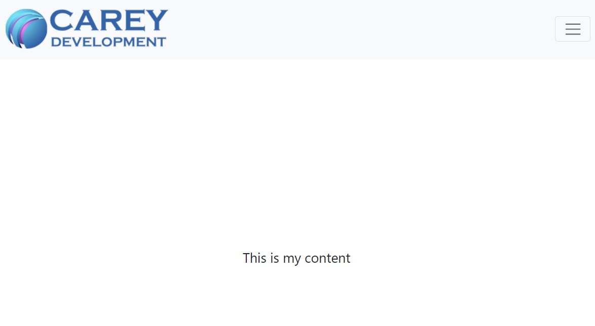
When the screen gets less than 1200px, it should revert to a responsive menu with a menu icon in the upper, right-hand corner.

Finally, switch the menu type back to vertical and view the application again in a small window. It should use the horizontal menu even though you selected a vertical sidebar.
And if all that worked, congrats! You now know how to configure a layout!
Wrapping It Up
Of course, you're not done.
All I showed you how to do here is change the menu style. There are plenty of other configuration options that you'll want to support in your final admin console.
I'll cover many of them as time goes on.
In the meantime, feel free to tinker with the code as you see fit.
Have fun!
Photo by Dmitry Demidov from Pexels


